Hey Picotado! is Daniela’s refined evolution of Picotado · Design Studio & Crafts, embracing a more focused and intentional approach to the relationship between design and handmade creation.
For this new chapter, a completely new brand identity was developed, defining its visual language, tone of voice, and positioning.
The identity is built around a black and white colour palette, allowing the vibrant colours of the products to stand out. By keeping the system neutral and minimal, the focus remains on the pieces themselves, highlighting their playful and expressive character.
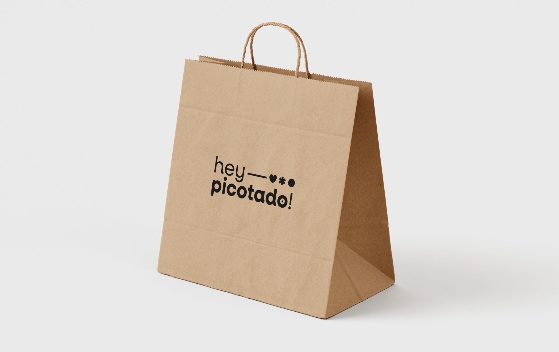
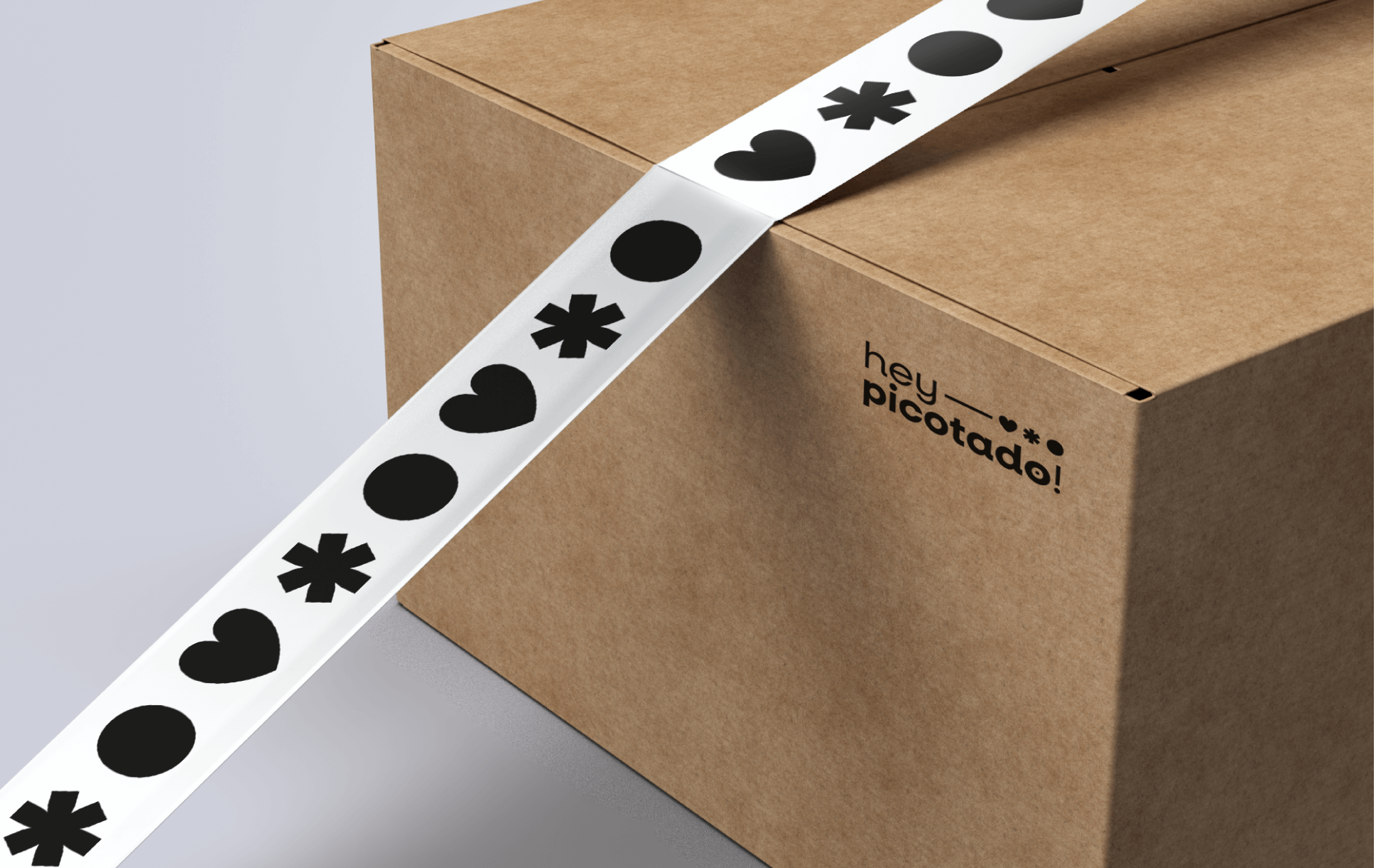
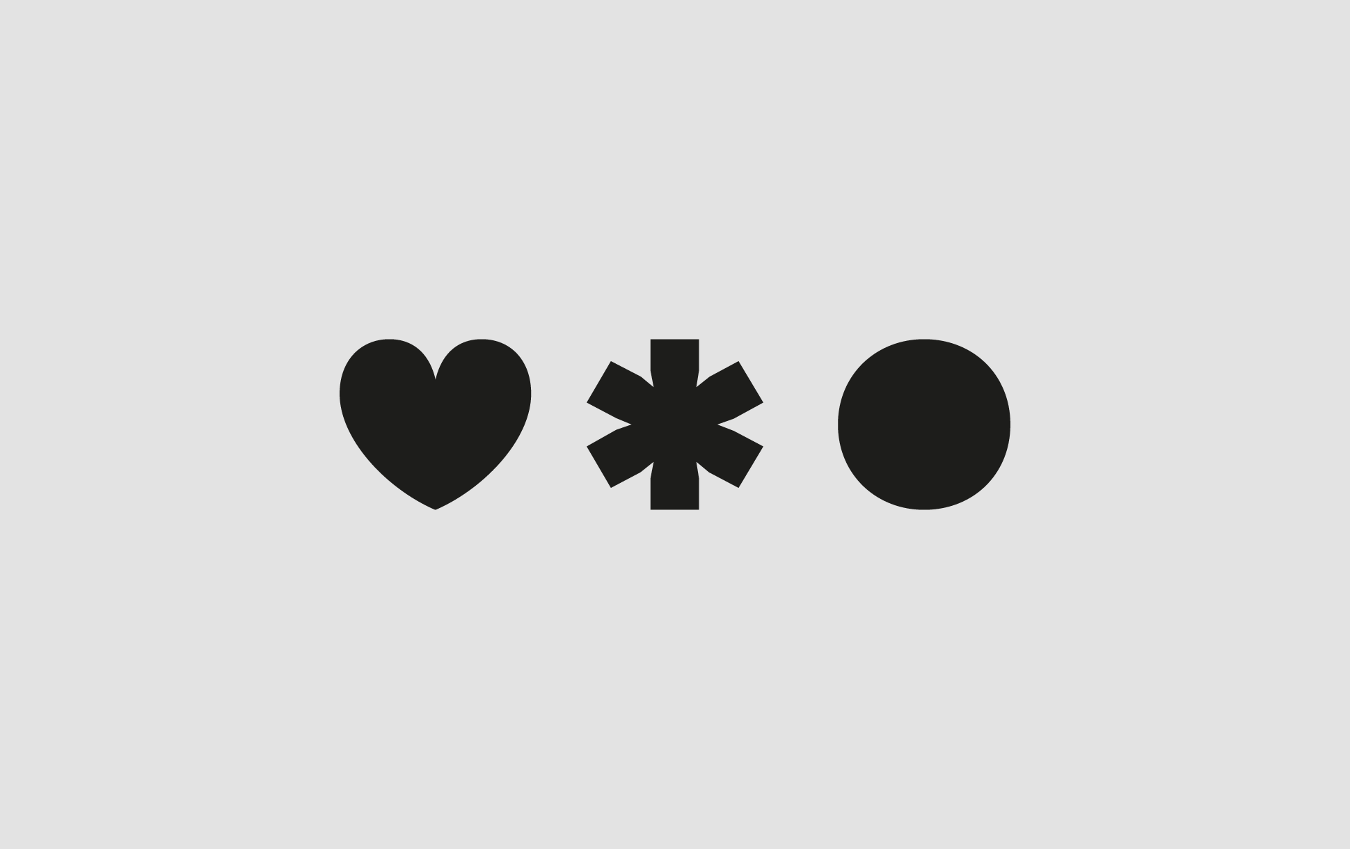
The logotype incorporates three graphic symbols, a heart, an asterisk, and a circle, representing Hey Picotado’s core pillars: home décor, party decoration, and stationery. These symbols reinforce the brand’s personality and create a flexible visual system that can adapt across applications.
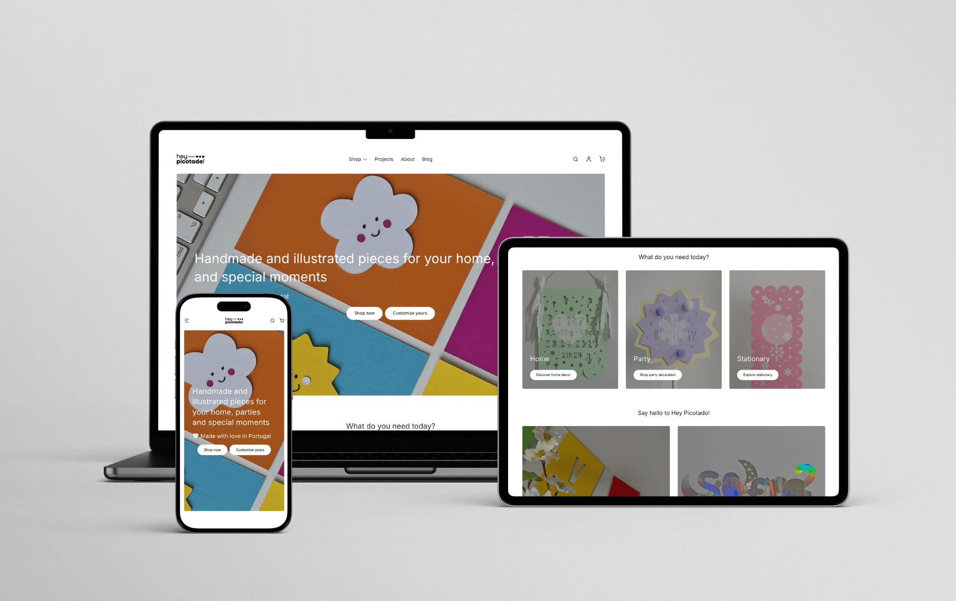
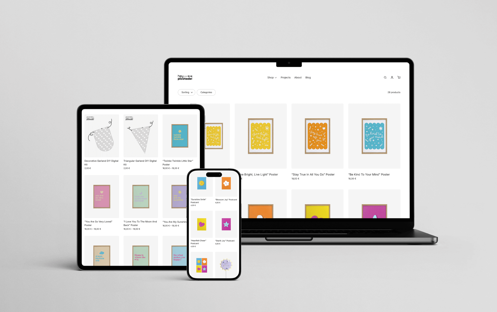
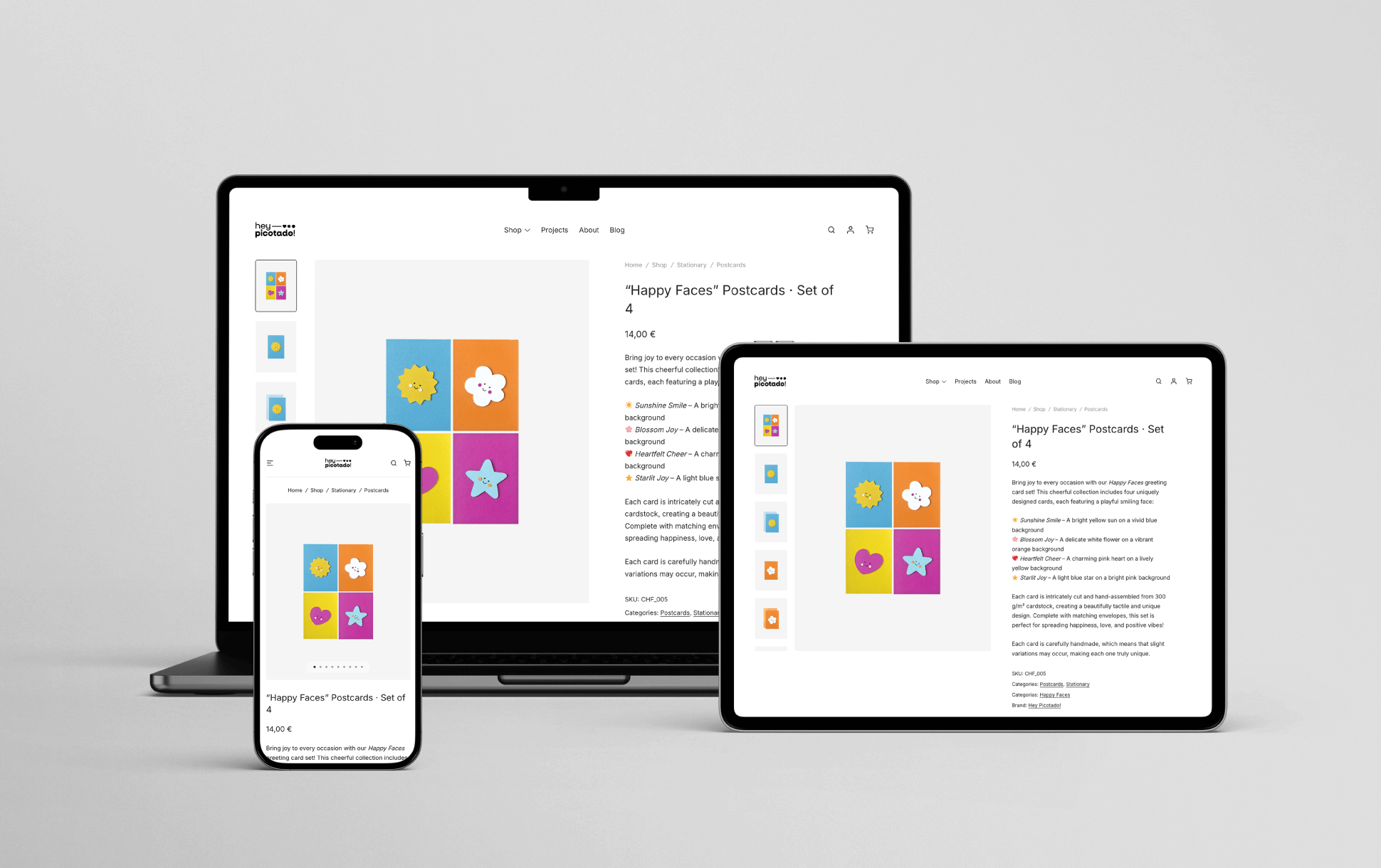
The project included the design and development of a fully functional e-commerce website, with product photography ensuring consistency across the online store.
Ongoing social media content, including photography and video editing, is created and curated to maintain a cohesive and recognisable digital presence.
Design Art Direction
Services Branding, UX/UI Design, Social Media Content